Whether it’s wall colors, accents or what-have-you, the right color choices make statements about your style, your influence – basically, your personality.
One way to make a strong statement is to use trendy colors. They’re not for everyone, but if you’re brave enough, you can turn some heads – maybe even your own.
So now, let’s take a look at 2018’s trendy colors. The headings may identify a specific color or a range of colors. Brace yourself!
Caviar Black
Black, in general, is a color you have to use carefully. It usually works better as an accent color, especially when using accessories.
With caviar black, accenting doesn’t seem too bold. It’s quite close to charcoal, which is a good fit if you’re using gray in your décor. If any of your other furniture pieces are dark, caviar black will not contrast too much.
Statement Turquoise
If you’re looking for bold, statement turquoise is this year’s ticket. A combination of blue and green, it will definitely blend well with many shades of each. And the beauty is that you can use it for an accent wall, or the entire room.
Nothing says “Forward” like the color “statement turquoise.”
Put Some Sunshine In Your Rooms
This is not the name of the color. The phrase covers several shades of goldenrod. If you plan to decorate a room mood that is happy and comfy, any of the rich yellows that bring warmth would be the ones to consider. Golden Ochre is one of such colors.
If you use accents like blue or cream, goldenrod colors will complement these very well.
Sophisticated Blush
Sophisticated blush combines light beige with a warmer pink, making it an ideal neutral color. A piece of furniture in this color makes a great accent piece.
Grounded Charcoal Brown
As to earth tones, the basic brown can serve as a go-to color. But the grounded charcoal brown is a warm blend of black and brown shades. It could be said that it resembles the soil, not necessarily in color, but symbolically. The daylight warms the color, while less light in the evening cools it.
Fiery Colors
This year’s pick is “Caliente” which in Spanish means “hot.” The suggested use of this color is on an accent wall. However, if you have a room exclusively for entertaining, or maybe you’re in your office, you might consider “energizing” the entire room in Caliente.
Ultra Violet
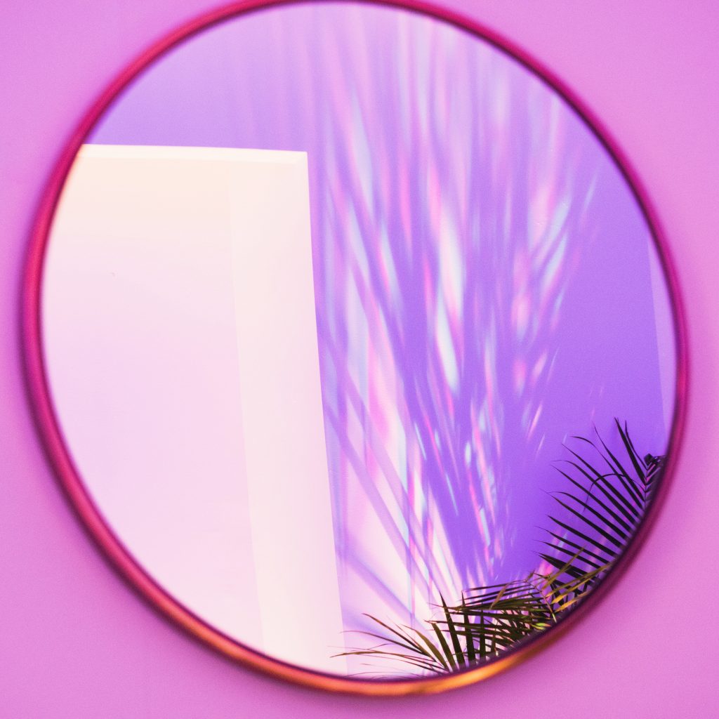
As purple shades go, Ultra Violet was named the color of the year. It will add richness as an accent color, and for the brave, a load of depth as an all-wall option.
Black
Most of the time, all-black rooms are just not appealing. However, if done right, especially if used to complement other color schemes, it can pop without bringing thoughts of gothic décor. This year, black is the new “neutral.”
Pastels
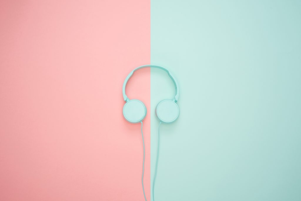
For charging the batteries, decompressing or just creating general harmony in a room, pastels will fit the bill. This year, one such tranquil combination of pastels includes Sandy Pink and Mint Green.
Summary
Even as generous as this list is, there’s a multitude of trendy shades and colors, even for this year. If you didn’t find a trendy color to your liking, keep looking. You may still have the opportunity to include a trendy color in your home décor.